
Native Creative That Converts: The Taboola Craft Guide
On a CPC network, creative isn’t decoration — it’s pricing. The headline that doubles your CTR halves your cost of attention, and the advertorial that holds readers decides whether those clicks become customers. This is the craft guide: headline mechanics, thumbnail rules, Motion Ads, the compliance lines, and a testing system sized for native’s brutal variance.
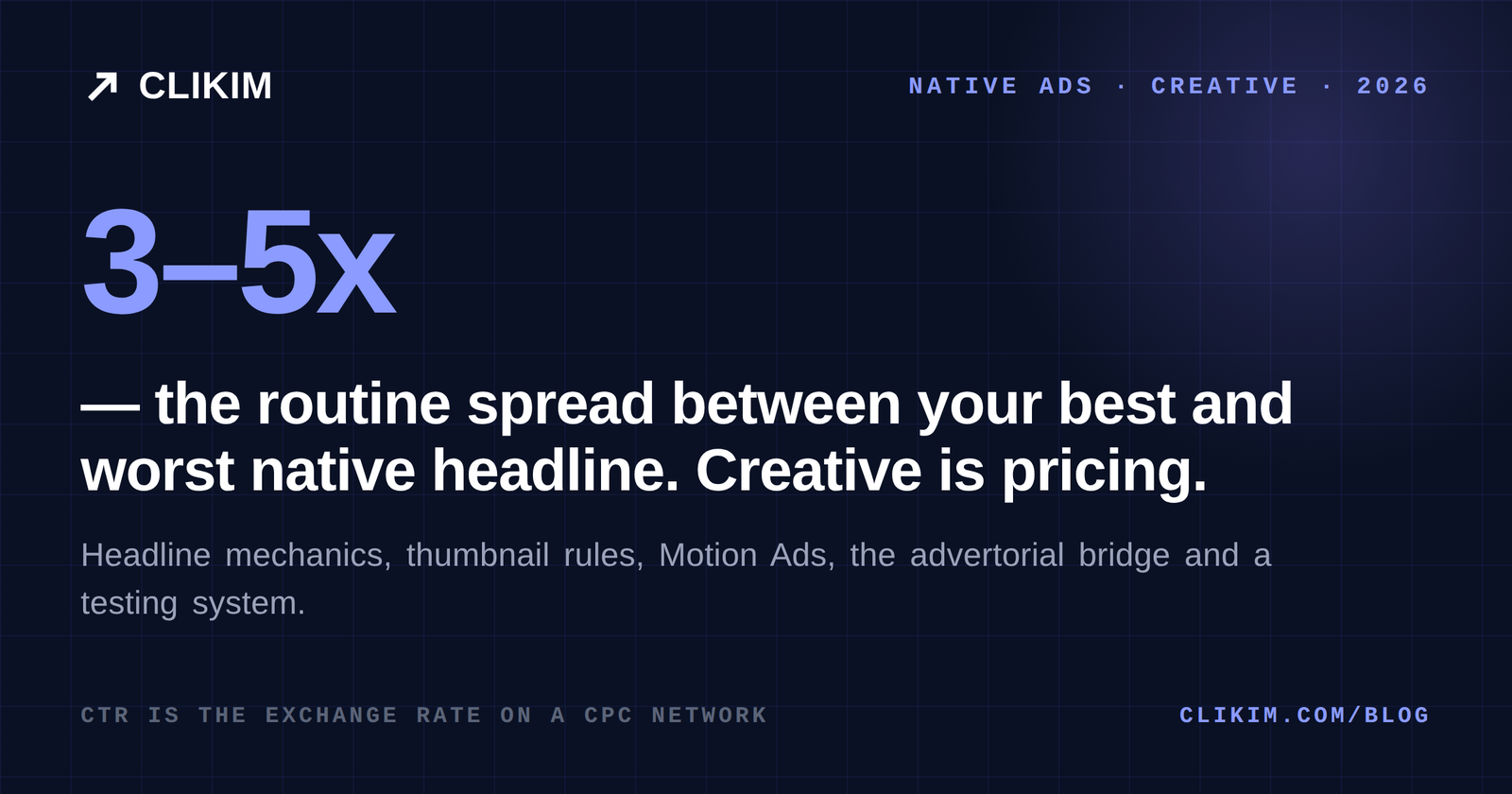
On Taboola, creative is your real bid: CTR moves your effective costs more than any setting in Realize.
The working formula — headlines that read editorial (specific, curious, honest referent), thumbnails that look like photojournalism rather than ads, 5–10 variants per campaign because native CTR spreads are wild, and an advertorial bridge that matches the ad’s promise verbatim.
The lines that keep it running: no fake testimonials or “winner stories”, claims you can substantiate, and advertorials labeled as sponsored. Editorial craft, honestly deployed, is the entire game.
Creative is pricing
Every CPC platform hides the same equation: the auction sells attention at CPM economics and charges you per click, so your CTR is the exchange rate. A card earning 0.2% CTR and a card earning 0.6% CTR pay wildly different effective prices for the same placement — on identical bids. Before touching bid strategies or site lists, understand that the cheapest optimization on Taboola is a better headline.
The feed context sets the craft rules. Your card renders next to editorial recommendations on Yahoo, NBC News, USA TODAY and thousands of smaller sites; readers are in lean-back discovery mode, not shopping mode. Creative that looks like an ad gets scrolled; creative that looks like the next interesting story gets clicked. Native creative is editorial mimicry with honest intent — and the platform’s rules exist precisely to keep the mimicry honest.
Headline mechanics
The anatomy of native headlines that earn clicks without burning trust:
- Specificity beats superlatives. “The $12 habit cardiologists keep recommending” outpulls “This amazing health trick” — numbers, prices and concrete nouns read editorial.
- Curiosity with a real referent. Open a loop the advertorial actually closes. Bait-and-switch trains the algorithm on clicks that bounce — you pay for those.
- Audience-calling works. “Homeowners in [state]…”, “Drivers over 50…” — native’s older, cheaper impressions convert when the headline names the reader.
- Editorial register, not brochure. Third-person, reported tone: “Why thousands are switching…” reads like the surrounding content; “Buy our award-winning…” reads like the thing readers came to avoid.
- Front-load the first 40 characters. Cards truncate on smaller placements; the hook can’t live at the end.
Write ten headlines per concept and let the auction vote. The spread between your best and worst will regularly be 3–5x — variance that big is a gift to systematic testers and a tax on everyone else.
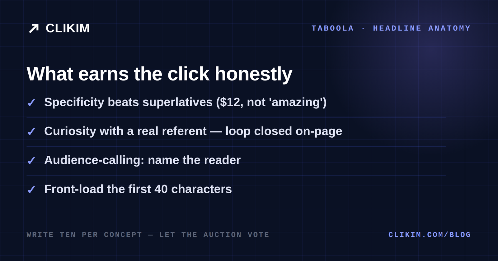
Anatomy of a feed headline: specific, curious, honestly referenced, front-loaded.
Thumbnail rules
The image buys the eye; the headline buys the click. What works in the feed, consistently:
- Photojournalism over production. Natural light, real settings, imperfect framing — stock gloss and white-background product shots read as ads instantly.
- Faces and hands doing things. A person mid-action (applying, holding, pointing at) beats both portraits and product-only shots.
- Close crops win small placements. Your card often renders at thumbnail scale — one clear subject, no text overlays (text in images is both ineffective at that size and a policy risk in regulated verticals).
- Contrast with the feed. News feeds skew dark and busy; clean, bright images with one subject pop. Test the opposite in lifestyle contexts.
- Match image to promise. The thumbnail is a claim too — an image that oversells what the lander delivers is a scent break and a compliance flag in one.
Motion Ads and video
Motion Ads — short looping motion in the card slot — are native’s cheat code for thumb-stopping without video budgets: a 3–6 second loop (product rotating, before/after wiping, text-free demonstration) borrows video’s eye-pull at image production costs.
Native video proper runs in-feed and outstream, autoplay muted — so it must communicate silent: captions, visual demonstration, and the same editorial register as everything else. Vertical assets from social reuse cleanly; recut the first 3 seconds for a muted context before porting.
The advertorial bridge
For considered offers, the card doesn’t sell the product — it sells the advertorial, and the advertorial sells the product. The bridge page craft, condensed: headline continuity (the advertorial’s title should feel like the card’s promise, kept); story structure — problem lived, discovery made, mechanism explained, proof shown, offer earned.
Also: editorial voice with one idea per paragraph and mobile-first rhythm; the first link after the mechanism, not in the intro; and speed — native clicks give you two seconds of patience, priced in real money.
The full funnel architecture — including quiz variants and per-vertical notes — lives in the affiliate playbook; the craft here applies to DTC advertorials identically.
The compliance lines
Creative is where Taboola’s enforcement actually looks, so build these in rather than bolting them on: no “winner stories” or jackpot testimonials in cards or landers (banned as a class, even when true); claims substantiated — health promises within documented limits, finance promises out of the prohibited zone entirely; advertorials labeled “Sponsored by X” at the top; and before/after imagery used carefully in health verticals, where it’s often restricted outright.
The pillar’s policy section maps the full territory — the creative-side summary is one line: write ads you’d defend to the publisher whose feed they run in.
A testing system for native
Native’s variance demands more structure than social testing, not less:
- Volume per round: 5–10 cards per campaign — fewer can’t map the variance; more starves each variant of data.
- One variable per family: test headline families against each other (curiosity vs specificity vs audience-called), then thumbnails within the winning family — factorial chaos teaches nothing.
- Judge on CPA, kill on CTR. Cards under ~0.15–0.2% CTR die fast regardless; cards with fine CTR but dead conversions are scent problems — fix the bridge, not the card.
- Refresh on a clock: native fatigue is slower than social but real; two fresh variants weekly keeps a scaling campaign breathing.
- Feed learnings sideways: a winning angle on Taboola usually wins on NewsBreak and native cousins — creative learnings are the most portable asset in this channel.
A starter swipe file
Ten angle templates that map to most offers — fill the brackets and test the spread: “The [price] [category] [authority group] keeps recommending” · “Why [audience] in [geo] are switching to [mechanism]” · “[Number] signs your [thing] is costing you money” · “What [profession] wish you knew about [problem]” · “The [adjective] way to [outcome] without [pain]”.
And five more: “[Geo] homeowners: this [year] rule changes [thing]” · “We tried [product category] for 30 days — here’s the honest verdict” · “The mistake most [audience] make with [task]” · “How [demographic] are [outcome] on a budget” · “[Mechanism], explained by someone who actually uses it”.
None of them are magic; all of them are honest structures the feed rewards. The magic is the testing system above, run weekly, on infrastructure that doesn’t blink when a winner needs budget — which is where managed access earns its keep.
Frequently asked questions
What makes a good Taboola headline?+
What image size does Taboola use?+
Are Motion Ads worth it on Taboola?+
Can I use before/after images in Taboola ads?+
How many ad variants should I run per campaign?+
Why do my Taboola ads get rejected?+
Creative testing needs room to run
Managed Taboola access through Clikim — funded balances and headroom so testing velocity is set by your pipeline, not your billing increments.